Understanding the Difference Between UI and UX Design: Why Both Matter
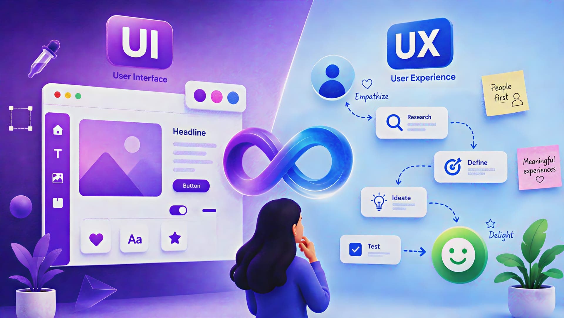
Think about the last app you deleted out of frustration. It probably wasn't ugly. It likely had decent colors, a modern font, maybe some nice touches. But something about it made you want to throw your phone across the room — a confusing checkout, a search bar that never found anything, a menu hiding the one button you needed. That gap between "looks fine" and "actually works" is where UI and UX design part ways, and it's why plenty of attractive products still lose customers.
Digital competition has gotten unforgiving. Customers don't wait around for a confusing site to make sense — they're one tab away from a competitor who got it right. That's turned user-centric design from a nice-to-have into table stakes. Instead of guessing what users want, teams now lean on research and testing to build around real behavior rather than internal assumptions.
Here's the part worth remembering: UI and UX aren't the same job wearing two hats. UI shapes what a product looks like and how it responds to a tap. UX shapes whether the whole journey — landing page to completed purchase — actually makes sense. A polished storefront with a broken checkout is a UX failure. A well-mapped user journey wrecked by clashing buttons is a UI failure. Businesses that treat these as separate checkboxes usually end up with exactly that kind of mismatch.
What Is UI Design?
UI (User Interface) design covers everything a person sees and touches on screen — the layout, the buttons, the whole visual layer sitting between the user and the system underneath. Good UI isn't decoration. Plenty of interfaces look sharp in a screenshot and still confuse real users within seconds. The actual job is building something clear enough that people instinctively know what to click and where to look next.
At its core, UI means color choices, typography, buttons, icons, menus, forms, spacing, layout. On an online store, that's the product photos, the "Add to Cart" button, the search bar, the checkout form — all of it. Done well, these pieces become a kind of shorthand: users learn quickly that a certain color means "go" or an icon means "delete," and once they've learned it, everything else gets easier.
A UI designer's day-to-day usually includes building visual concepts, locking down a color palette and type system, designing the buttons and forms people touch constantly, establishing visual hierarchy, adapting layouts across screen sizes, maintaining a design system, and building clickable prototypes. Accessibility runs through all of it — an interface that looks great but fails contrast standards isn't actually good UI.
A few elements do most of the heavy lifting:
- Colors guide behavior, not just branding — a bold "Buy Now" button, a red error flag. Contrast matters more than most people realize.
- Typography decides whether someone can scan a page or has to squint through it. Consistent type also builds quiet brand recognition.
- Buttons and icons are shorthand for action. A recognizable icon lets users act on instinct instead of hunting for a label.
- Layout and hierarchy determine what someone notices first. Get this wrong and even simple pages feel cluttered.
A strong UI makes a product feel trustworthy. But visuals alone can't save a product if the underlying journey doesn't hold together — that's where UX design comes in.
What Is UX Design?
UX (User Experience) design is less about how something looks and more about whether it actually works — whether someone can get from point A to point B without wanting to give up. Good UX covers the entire arc, from a first visit to task completion and, ideally, a return visit. On an ecommerce site, that means understanding how people search, compare, add to cart, and check out — not just designing a nice product page.
UX is fundamentally a problem-solving discipline: studying real behavior, mapping flows, prototyping, and testing before a line of production code gets written. The goal is stripping out unnecessary friction so people can do what they came to do — and this applies well beyond apps and websites, to SaaS tools, internal software, anything with a user on the other end.
A UX designer's responsibilities typically include user and market research, identifying pain points, building personas and journey maps, mapping navigation logic, organizing content, wireframing, prototyping, running usability tests, and turning feedback into real changes. The work loops rather than marching in a straight line — designers rarely assume their first idea is right; they test, watch, and adjust.
The core pieces of UX work:
- User research is where everything starts — interviews, surveys, analytics — feeding decisions instead of internal hunches. If checkout abandonment is high, research reveals whether the culprit is a clunky form or hidden fees.
- Information architecture is the organizational skeleton. Great content buried under confusing categories is still unusable content.
- Wireframing strips a page to its bones — structure and flow, no polish — so ideas can be tested cheaply before real design time gets sunk in.
- User testing is where assumptions meet reality. Watching real people attempt a task surfaces problems invisible from inside the design process.
UX pushes teams past "does this look good?" toward "does this actually serve the people using it?" — which is exactly why it has to work hand-in-hand with UI, not in isolation. That combined discipline — research and structure feeding the interface that delivers them — is what UI/UX design actually means in practice.
UI vs UX: Understanding the Key Differences
Purpose and focus: UI asks how the interface looks and feels. UX asks how the overall experience works. On an ecommerce site, UI shapes how the product cards and checkout screen look; UX shapes whether customers can actually find what they want and complete the purchase.
Design process: UX usually starts first — research, journey mapping, wireframes, testing — and stays iterative as feedback rolls in. UI ramps up once structure is settled, focusing on visual concepts and high-fidelity screens. In practice, the two loop back on each other constantly rather than following a clean handoff.
Deliverables: UX typically produces research findings, personas, journey maps, user flows, information architecture, wireframes, and usability reports. UI typically produces high-fidelity designs, color palettes, type systems, icon sets, design systems, and responsive layouts.
Skills required: UI leans on visual design, typography, color theory, and prototyping tools. UX leans on research methods, usability testing, and information architecture. Smaller teams often blend both — plenty of "product designers" do the full spectrum.
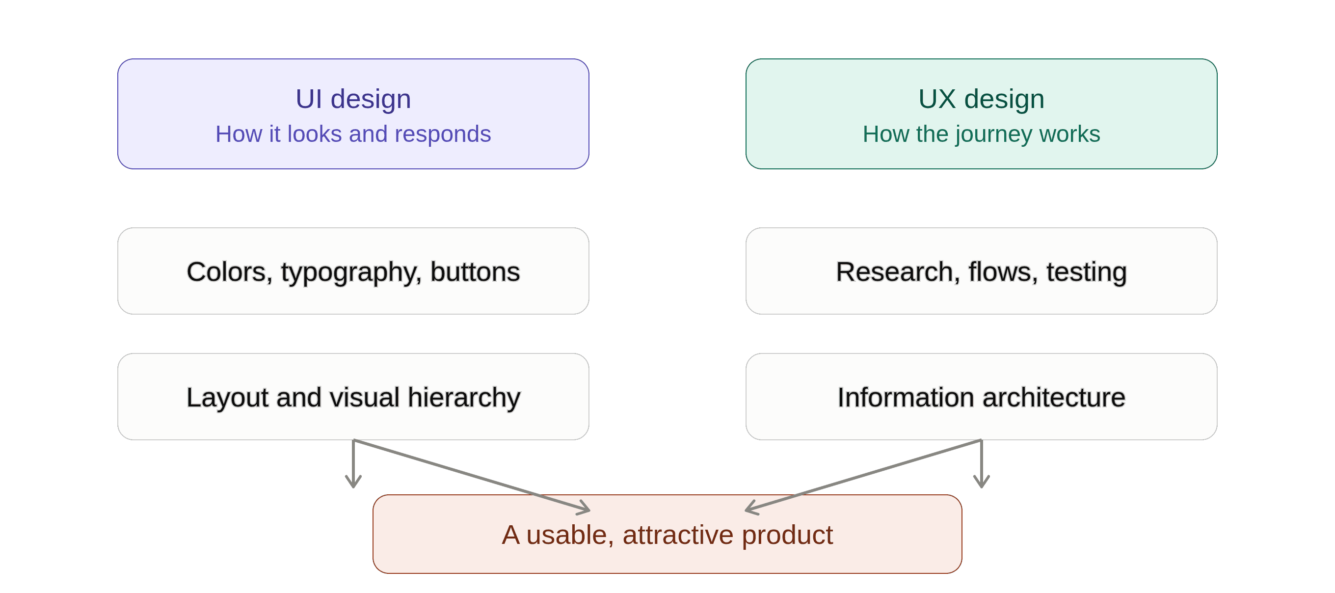
UI vs UX: Comparison Table
| Aspect | UI Design | UX Design |
|---|---|---|
| Full Form | User Interface Design | User Experience Design |
| Primary Focus | Visual interface and interactions | Overall user experience |
| Main Goal | Attractive, clear, consistent interface | Useful, intuitive, easy-to-use product |
| Key Question | How does it look and interact? | How does it work for the user? |
| Focus Areas | Colors, typography, buttons, layout | Research, flows, IA, testing |
| Deliverables | High-fidelity designs, design systems | Personas, wireframes, research findings |
| Success Measure | Clarity, consistency, accessibility | Usability, task completion, satisfaction |
How UI and UX Work Together
Treating UI and UX as competing priorities is where teams go wrong. UX figures out what the experience should be; UI makes that experience visible and interactive.
A dazzling interface can't rescue a broken journey — beautiful colors mean nothing if people can't find the "buy" button or get stuck mid-checkout. The reverse is just as true: a well-planned user flow feels cheap if the interface delivering it is inconsistent. Imagine a product page with gorgeous photography and a perfect "Buy Now" button, but five confusing steps between that button and a finished order — that's a UX problem hiding behind good UI. Good UI attracts users. Good UX keeps them.
On ecommerce sites, UX decides how people filter and check out; UI decides how those elements look. On mobile apps, UX shapes how users move between screens; UI provides the icons and gestures that make those moves obvious — think of a banking app, where UX makes transfers simple and UI makes them visually unmistakable. On SaaS platforms, UX organizes feature-heavy complexity into logical workflows, while UI uses dashboards and cards to make that complexity digestible.
Aesthetics and usability aren't actually rivals. A strong interface builds a good first impression, but the visuals should be doing work — clear type improves readability, consistent color speeds up recognition, sensible spacing cuts visual noise. None of that is decoration for its own sake; it's usability wearing a nice outfit.
Why Both UI and UX Matter for Business Success
Good UI and UX design shows up directly in business metrics, not just design awards.
Customer satisfaction rises when a product is easy to navigate — that ease shapes how people feel about the whole brand. Conversion rates often hinge on small obstacles most teams never notice; UX finds where people drop off, UI makes the fix visible. Retention depends on consistency — a product that keeps its promises interaction after interaction earns loyalty. Brand perception gets shaped by every interaction, whether users notice consciously or not; a polished, reliable interface signals professionalism. Development costs shrink when usability problems get caught during wireframing instead of after launch, when fixing them means rebuilding and retesting.
Common UI and UX Mistakes to Avoid
Prioritizing visuals over usability is the most common trap. Animations and elaborate layouts can feel modern, but if they bury the price or the "Add to Cart" button, they're working against the user.
Ignoring user feedback leads to products that look great internally and confuse everyone else. Feedback from usability tests and support tickets is free information about what's actually broken.
Inconsistent design elements force people to relearn the interface as they move around. If a button looks different page to page, users stop trusting it does the same thing.
Poor navigation structure loses people fast — too many menu items, vague labels, pages buried too deep. If someone can't find pricing in a couple of clicks, they'll often just leave.
The common thread: designing from the internal team's perspective instead of the user's. Worth checking constantly — can someone unfamiliar with the product actually use it?
UI and UX Design Trends in 2026
AI-powered personalization is reshaping how products adapt to individual users — recommendations based on behavior, dashboards that reshuffle based on how someone actually works. The catch: personalization has to stay predictable, or it starts to feel like the product is making decisions behind the user's back.
Accessibility-first design has moved from afterthought to starting principle — contrast, readable type, keyboard navigation, and screen-reader compatibility built in from day one. The side benefit: accessible design tends to be better design for everyone.
Micro-interactions — small feedback moments when a button responds or a form confirms an entry — keep products feeling alive. Subtle, but they matter; a button that gives no feedback feels broken even when it technically works.
Voice and conversational interfaces are opening interaction patterns beyond menus and buttons. Chat support and voice assistants let users skip the learning curve entirely — but they still need real UX thinking behind them, so users know what the system can do and how to recover when it misunderstands.
None of this matters if it's chasing novelty for its own sake. The products that benefit are the ones using new tools to solve real problems, not just to look current.
How to Choose the Right UI/UX Design Partner
The wrong design partner delivers pretty screens that don't solve anything. The right one understands your users and business goals well enough that decisions hold up after launch.
Worth asking before hiring: How do you get to know our users before designing anything? What does your actual process look like? Do you run usability testing, or just design and ship? How do design decisions tie back to business goals? What will we actually receive along the way? How do you approach accessibility and different devices? How will we know if the final design worked?
Look for a user-centered approach backed by research rather than gut feeling, clear communication, strategic thinking that connects design to business outcomes, technical awareness so what's designed can actually be built, and real attention to detail.
A portfolio full of attractive screenshots proves someone can design — it doesn't prove they can solve problems. Look instead for case studies explaining what was broken, how it was diagnosed, what was tested, and what improved. The real question isn't "does this look good?" It's "does this help our users get what they need while supporting our business goals?"
Conclusion
UI and UX aren't competing disciplines — they're two halves of the same job. UI handles the visual and interactive layer: color, type, layout, buttons. UX handles the bigger picture: research, structure, flow, and whether people can actually accomplish what they came to do.
Treating them as separate checkboxes is where things go wrong. A beautiful interface can't save a confusing journey, and a brilliantly planned flow loses its impact if the interface delivering it feels clumsy. The strongest products bring both together from day one.
For businesses and startups, that's the real takeaway: UI and UX design isn't decoration bolted on at the end. It's product strategy. Whether you're building a new site, launching an app, or rethinking an existing platform, investing in both isn't optional if you want something that actually works — not just something that looks like it should. The best digital products were never just the good-looking ones. They're the ones that quietly get out of the user's way and let people do what they came to do.
Ready to Build Something People Actually Want to Use?
If your product looks the part but customers still drop off — abandoned carts, ignored features, a signup flow nobody finishes — the problem usually isn't the visuals. It's the journey underneath them.
That's the work we do: research-led UI/UX design that starts with your users' real tasks and ends with a design system your engineers can build from without guessing.
Bring us the product you're launching, or the one that isn't converting. Get in touch and we'll tell you what we'd fix first.